
Fleet reports and analytics
Fleet reports and analytics in Wialon turn the stream of points coming off the trackers into figures you can read: mileage, engine hours, fuel, idle time, breaches and the workload of each vehicle. Managers get KPI dashboards and regular summaries they can base cost decisions on, instead of guessing from waybills.
- 1 Van 10-XX-123 9178% utilisation, no breaches
- 2 Tractor unit 90-XX-417 84consumption within the norm, 2 speeding events
- 3 Van 77-XX-208 736 h idling with the engine on
- 4 Tipper 10-XX-560 66consumption +12% over the norm
- 5 Van 99-XX-031 48moving on 2 days out of 6
From the data on board to the dispatcher's decision
Tracker and sensors
Coordinates, ignition, fuel, engine hours and speeding events arrive every 30–60 seconds.
Wialon history
The raw messages are stored on the server, so a report can be built after the event for the whole retention period.
A report per question
We configure tables and charts around decisions: costs, workload, breaches, servicing.
Dashboard and distribution
KPIs on the manager's screen and a Monday summary to email or Telegram.
Features and tools
Reports
Analysis
- Analysis of how the fleet is used (utilisation rate)
- Consolidated reports by branch and by vehicle group
- Comparison of periods by mileage, consumption and idle time, allowing for season and fleet composition
- Searching for anomalies and breaches in vehicle operation
Delivery
- Configurable KPI dashboards for a quick overview
- Automatic distribution of reports by email and Telegram
- Export of data to Excel, PDF, CSV and XML
A fleet manager's week seen through the reports
An illustrative example: a distributor in Baku with 30 vehicles. How the mailings and the dashboard turn into decisions.
- Monday: the week's summary in the inbox PDF
Mileage, fuel, idle time and breaches by group. It opens on a phone and takes a couple of minutes to read.
- Tipper 10-XX-560 is above the consumption norm +12%
The day-by-day breakdown shows the rise began after the fuel system was repaired — the vehicle goes back to the workshop.
- Van 99-XX-031 ran on 2 days out of 6 33% utilisation
The utilisation report suggests the vehicle could move to another branch instead of hiring one in.
- Comparison with the same month last year season
We compare season with season rather than with last month, so summer air conditioning and winter warm-ups do not distort the conclusion.

A report starts with a question, not with a table
The usual situation after going live: Wialon holds hundreds of templates, the dispatcher exports everything in sight, the manager receives a 40-sheet Excel file and stops opening it within a week.
We start from the other end. At the first meeting we ask what decisions you make every month. How much to pay the drivers. Which vehicles to sell. Why fuel costs more this quarter than last. Which of the forwarders actually covers 25 points and which covers 12. A separate report with two or three key figures is built around each of those questions.
The data for the reports comes from Teltonika and Queclink trackers: coordinates, speed, ignition, engine hours. If fuel level sensors, a CAN adapter or a driver card reader are fitted, litres, engine revs, fault codes and the driver's name are added to that. Everything is stored on GPS.az servers in Azerbaijan (Wialon Local), and any report can be built after the event for any period still in retention.
A practical rule: if a report does not lead to an action — a bonus, a penalty, a reallocation of vehicles — it is surplus to requirements.
The five reports people open most often
In our experience with fleets of 10 to 300 vehicles in Baku and the regions, this is what actually gets looked at every week. The rest is on request.
A vehicle summary for the shift
Mileage, time moving and time stopped, engine hours, first and last departure. It answers the question of what the vehicle was doing yesterday in ten seconds, without looking at the track.
Fuel: norm against actual
Consumption per 100 km and per engine hour, refuelling with a link to the place, suspicious falls in level. There is a detailed account of how drains are worked out on the fuel control page.
Driver breaches
Speeding, harsh manoeuvres, idling, departures outside the schedule. It reduces to a ranking that is easy to tie to a bonus.
Geofence visits
Arrival and departure times at warehouses, sites and customer points. Used for planned versus actual deliveries and for disputes with a client about arrival times.
Fleet utilisation
The share of time a vehicle actually worked. It shows which units stand idle for weeks and could be sold or moved to another branch.

Dashboards, scheduled mailings and export
A manager does not need access to every report. What he needs is one page of KPIs: how many vehicles are out today, total mileage, fuel consumption this week against last, the number of breaches and the five most troublesome vehicles. We put that dashboard together in Wialon and open it on a phone through the mobile app or a browser.
Regular reports go out by themselves. The schedule and the recipients are configured:
- daily at 8:00 — a summary of yesterday's shift to the dispatcher and the garage manager;
- on Mondays — the weekly fuel report to the finance director;
- on the 1st of the month — the monthly branch summary to the manager;
- at the moment of the event — a Telegram alert about a drain or a departure at night.
Export is available to Excel, PDF, CSV and XML. The accounts department usually takes Excel for calculating fuel and lubricants, while lawyers and insurers take a PDF with the track and a timestamp. If the data is needed in 1C, an ERP or a BI system, there is no sense in exporting by hand: that is what the API and integrations are for.
Consolidated branch reports are built on groups of objects. The fleet is divided into Baku, Sumgait and Ganja, say, and each branch manager sees only his own vehicles while head office sees them all at once and side by side.
Which figures different people in the company need
The owner and the chief executive
They care about money and trends, not about individual runs. Cost per kilometre and per engine hour across the fleet, how fuel consumption moves month by month, how many vehicles the business genuinely needs.
The most useful tool here is comparing periods: this month against last, this season against the same season a year ago. If consumption per 100 km has risen by 8% on the same route, that is grounds for looking into it rather than a coincidence.


Why the figures in reports sometimes do not add up
Analytics is only as honest as the sensors and objects behind it are correctly configured. Here are the discrepancies we are most often asked to sort out.
- GPS mileage is lower than the odometer. Usually this is gaps in coverage in tunnels or in the mountains beyond Guba, where the tracker sends its points on later, or points recorded too rarely on bends. The cure is to adjust the recording intervals.
- Engine hours do not match the machine's own counter. The tracker counts by ignition while the counter goes by engine revs. For plant we fit an engine operation sensor or take engine hours from CAN.
- Consumption from the sensor jumps about. A fuel level sensor without proper filtering reads fuel moving on a poor road as refuelling and drains. Filtering is configured in Wialon for each tank.
- Comparing periods is misleading. January and July on Absheron give different consumption because of warm-ups and air conditioning. Compare with the same season last year rather than with last month.
To find anomalies we set up separate rules: a vehicle that moved with the ignition off, a refuelling larger than the tank, a daily mileage above what is physically possible. Such events go into a separate report and are reviewed by hand.
A glossary of metrics: how each figure is worked out
An argument that runs I get a different consumption figure almost always means two people are counting different things. So we attach a short glossary to each report: the formula, where the data comes from and what happens when the data falls short.
Mileage, km
The sum of the distances between track points while moving. The source is GPS, and on vehicles with CAN the odometer can be used. If the tracker was out of contact, the points are sent on from memory; if the tracker lost power, the stretch stays empty and is marked in the report as a gap.
Engine hours
Time with the ignition on, or from an engine operation sensor. The source is the ignition input, a rev sensor or CAN. The figure from the ignition is always higher than the figure from revs — worth knowing before comparing with the machine's own counter.
Consumption, l/100 km and l/engine hour
Litres used over the period divided by mileage or engine hours. The litres are counted from the fuel level sensor (starting level + refuelling − closing level) or from CAN. Without a sensor it is a calculation against the norm, and the report says so.
Idling with the engine running
Time when the speed is below a threshold and the ignition has been on for longer than a set number of minutes. The threshold and the minimum duration are settings, and we record them in the glossary, otherwise figures for different months cannot be compared.
Utilisation rate, %
Days or hours a vehicle worked, divided by the time available. What matters is what goes into the denominator: the calendar, working days or working hours. Vehicles in the workshop are better excluded with a marker of their own than counted as idle.
Breaches
The number of speeding events, harsh manoeuvres and departures outside the schedule. They are counted against thresholds in the settings. When comparing drivers we normalise per 100 km, otherwise whoever drives most always looks worst.
What a finished report looks like in PDF and Excel
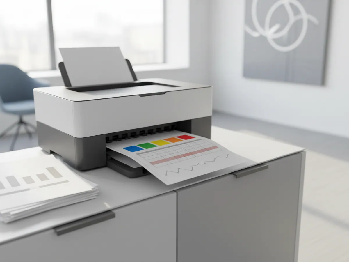
A description of the anonymised weekly fleet report we usually build first. The figures in it will be yours; the structure will be roughly this.
- The first PDF page — a header with the period and the vehicle group, five headline figures (mileage, engine hours, litres, idling with the engine on, number of breaches) and a comparison with the same period a month or a season earlier.
- The table by vehicle — one row per unit: plate, driver, mileage, consumption per 100 km or per engine hour, deviation from the norm. Rows with a deviation above the threshold are highlighted.
- Charts — fuel level and speed for the problem vehicles, with refuelling and suspicious falls marked.
- A Data quality sheet — the vehicles that had gaps in coverage, losses of power or no sensor at all. Without that sheet a manager does not know which figures to trust.
The Excel version holds the same tables without the charts, one sheet per section, so that the accounts department can filter and consolidate the data at their end. A sample built on your own vehicles is best shown on a demo account: that way you can see the report counting your fleet rather than a tidy example.
What changes when the reports are genuinely read
Disputes are settled on the data
The driver says he was stuck in traffic on Babek Avenue while the track shows him parked outside his house. The conversation is shorter and the bonus fairer.
Surplus vehicles become visible
The utilisation report regularly finds 1 or 2 vehicles in every 20 that work less than a third of the time. They can be sold or moved to another branch.
The fuel budget becomes predictable
Once consumption norms are worked out from actual figures for each model and each season, planning the fuel budget for the next quarter is simpler and more accurate.
Less manual work
Waybills, timesheets and fuel card reconciliations are assembled from the reports automatically. The dispatcher spends time on runs rather than on Excel.


Three ways of getting your reports
Usually all three are in use — for different people in the company.
| Wialon interface | Scheduled mailing | API and BI | |
|---|---|---|---|
| No need to log into the system | No | Yes | Yes |
| Any period after the event | Yes | No, on a schedule | Yes |
| Charts and tracks on the map | Yes | Yes, in the PDF | No, data only |
| No programmer needed | Yes | Yes | No |
| Data alongside ERP and 1C | No, manual export | No | Yes |
Fitting and cost
The feature becomes available once you are connected to the GPS.az platform. The cost is made up of the hardware, the fitting and a monthly subscription, which includes the SIM card traffic — the total depends on the type of vehicle and the set of sensors. We prepare an exact quote for your fleet free of charge within one working day.
- 1 Your enquiry and the list of vehicles
- 2 The quote and an agreed fitting schedule
- 3 Fitting the hardware at your own site
- 4 Setting up reports and alerts in Wialon, and training the dispatcher
Questions about “Fleet reports and analytics”
Request a call
A specialist will call back and match a solution to your fleet and your task.